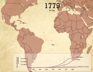
“Slave merchants brought the vast majority of enslaved Africans to two places: the Caribbean and Brazil. Of the more than 10 million enslaved Africans to eventually reach the Western Hemisphere, just 388,747—less than 4 percent of the total—came to North America. This was dwarfed by the 1.3 million brought to Spanish Central America, the 4 million brought to British, French, Dutch, and Danish holdings in the Caribbean, and the 4.8 million brought to Brazil.
This interactive, designed and built by Slate’s Andrew Kahn, gives you a sense of the scale of the trans-Atlantic slave trade across time, as well as the flow of transport and eventual destinations. The dots—which represent individual slave ships—also correspond to the size of each voyage. The larger the dot, the more enslaved people on board. And if you pause the map and click on a dot, you’ll learn about the ship’s flag—was it British? Portuguese? French?—its origin point, its destination, and its history in the slave trade. The interactive animates more than 20,000 voyages cataloged in the Trans-Atlantic Slave Trade Database. (We excluded voyages for which there is incomplete or vague information in the database.) The graph at the bottom accumulates statistics based on the raw data used in the interactive and, again, only represents a portion of the actual slave trade.
Interactive animated map and full original article HERE

